Checklist: 23 Essential UX and A11Y Features for Product Listing Pages
Conversion rate optimization starts with the shopping cart and product detail pages, but once you are done with the critical parts, it is time to squeeze out maximum performance from other pages too. We created a checklist to help you instantly get 23 essential UX and A11Y features to your Product listing pages (PLPs).

Importance of Product listing pages (PLPs) for CRO
Before we dig into the PLP, let’s drill down through the customer journey. The ultimate step of any Conversion Rate Optimization (CRO) effort is a transaction – in ecommerce; it is usually the purchase, right? If you track back your customers' journey, the previous step has always been visiting your Shopping cart.
How did customers get there? Most often from some Product Detail Page (PDP). One step further away from the conversion is the Product Listing Page (PLP), displaying your products in some sort of grid or line view. The list can show all products or results of specific search queries or offer users the option to create filtered views.
Ready to master your website’s CRO? We put together everything we know for you in these articles:
- Give your ecommerce a CRO boost
- Checklist of UX and A11Y features for PDPs
- Essential features for PLPs (this article)
- Premium UX and A11Y features for your PLPs
Now, let's dive into the essentials. Before we get to the checklist of features for a seamless user experience and accessibility on your PLPs, let’s sum up what role PLPs actually play in the customer journey.
Product Listing Page’s Main Goal
Are you familiar with the feeling of being overwhelmed by too many options? It's a common flaw of low-quality ecommerce websites. Try to step into your customers’ shoes and imagine that the number of choices on your product listing page feels excessive. That you are feeling frustrated after just a few minutes of shopping. That you are as lost as Alice. And the role of a well-crafted PLP is to protect you from all of these negative experiences.
Successful PLP is not only showcasing your products; it gives users a positive feeling of control and choice.
That’s easier said than done, but you can quickly fix it one step at a time if you know what to do.
- The layout of your PLP should be clean, organized, and visually appealing.
- Users should be able to scan through and understand all options available.
- There should be enough options to filter, sort or drill down to categories.
- In the grid, all necessary information should be clearly visible.
Enable users to narrow their choices and effectively filter and sort them. Incorporating the right options into your website simplifies their decision-making process and makes them feel in control. When customers can easily find what they're looking for and compare the best options side by side, you rapidly increase their satisfaction.
User experience (UX) is as important as ever nowadays, but success in the digital landscape can’t exist without including all users. That’s why we emphasize the importance of accessibility (A11Y) features in our checklists. Accessible design is the future of the internet!
________
Serious about transforming your ecommerce? Let’s talk about your website with Actum’s design experts. Get your free 30-minute consultation now.
________
And now, we are getting to our curated checklist of features you can easily integrate into your PLPs. No need to start from scratch!
Checklist of 23 PLP Essential UX and A11Y Features
There are three categories of features that you should already find on your ecommerce website, or that shouldn’t be a problem to develop as they belong among the best practices of user-friendly design.
General Functions and Design Features
- Value proposition.
Make sure that every page includes value prop. It should be clearly stated on the listing of a specific category (gaming laptops, Slim&Fit T-shirts, …) as well as on all the product pages.
- Finite scroll only.
Do not use infinite scrolls; this feature hurts your website’s UX and A11Y. Use the Next page or Show more buttons instead. No one should get lost in the neverending tsunami of more and more products.
- Be proud of the number of items.
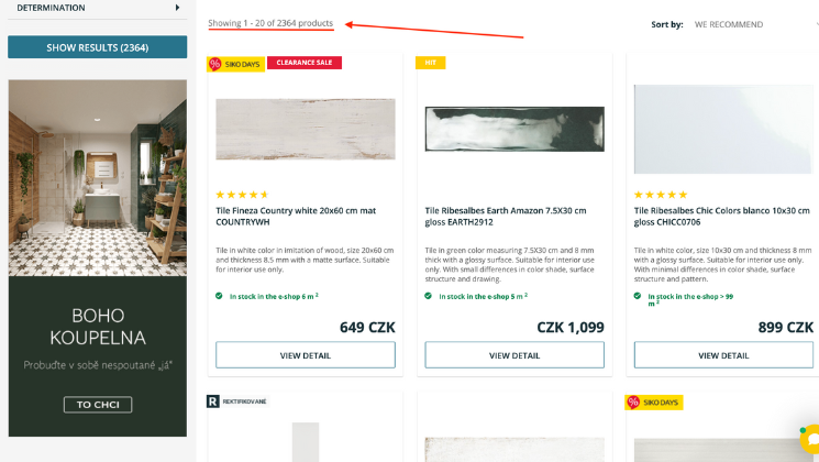
Prominently display the number of products in the listing on the top. Never hide it, hoping that you make people scroll to find out. If your online store offers large numbers of products, always try to organize them to save users from nick-picking. Display prominently on the top.

- Remember filtering.
Save the filter query for your users. Nothing is worse than if you create your own custom filter, and it’s lost when you open some product detail. After clicking the return button, users should land on the listing with their custom filter applied to continue browsing where they ended.
- Keep the view organized.
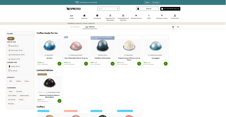
Show your best-selling products on the top, use “Our recommendation” sorting and give users additional choices (sort by low or high price, rating, best sellers, …).

- Recently added section.
Do you have loyal customers who are repeatedly coming back? Prepare for them the “Recently added” option. It can be a specific section in the grid, filter option or just a badge on the product listing. Little details do wonders.
- Show where to click.
Having enough space in the list, always try to add specific buttons to open product detail (Show details, View product, ...). Make the Product name an interactive link if you can't fit so many buttons.
- Tell them where they interact.
Striving for accessibility, give the button Show details correct aria-label specifying the displayed product name. If it misses the description of variant or/and color, add those too. Users with screen readers will thank you as they know which product details they click on.
- Always show prices.
In the listing, there should always be a clearly displayed price of the product. We know it can get too complex when it comes to B2B, but at least try to communicate the “Starting from” price.
- Correctly discounted prices.
For discounted prices, always use the visible label “Previous price”. The strikethrough price is not enough, especially from the A11Y point of view, as screen readers won’t recognize strikethrough format reading users two different prices creating unnecessary confusion.
Filtering and Sorting Category
- Tidy up large numbers of products.
Marketplaces and ecommerce with thousands of products should always create a structure in listings. Use categories and subcategories, and offer helpful sorting methods and filters so your users always find only what they are looking for. - Filter skip link.
Keyboard-only users should always have the option to skip the whole filter component. For instance, think about having to tab through the entire Amazon dropdown navigation, which has links nested in links, before you even reached the search bar or any relevant content: that is the problem that a skip link solves for keyboard or screen reader users.
- Understandable filter categories and values.
Some ecommerce enjoy technicality and precision, yet it can hurt your conversion rate when it’s too complicated. Make sure your customers understand categories used in filters (for example, Display size) and set values for them that are understandable (11”, 13.3”, 15”, 17”, …).

- Filter categories: Specific yet predictable.
Users should find what they are expecting in your filters. Use categories that do not overlap (Size vs. Dimensions) and avoid blur names for categories (Specs).
- Filter categories: International friendly.
Be sure to offer correct versions of local choices. Typically applies for measurement units, currencies, etc.
- Filter categories: Mobile friendly.
Design filter categories to fit easily to mobile screens. The filter option should always be displayed with categories collapsed by default on mobile devices.
- Filter categories: Top-down attitude.
Do your homework, research data and place frequently used filters higher, so users don’t have to search for them frantically.
- Filter categories: Confirm choice.
Avoid dynamic filtering, as users are still in the process of customizing their filters. Use the Apply Filter button to confirm the final choice, which improves UX and A11Y.
- Filter categories: No scrollbars.
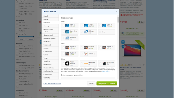
The final rule for filter categories is that they should always be accessible without scrollbars. If you can’t fit them into the window, go for the Show All button to display all filters in accordion.
Photos and Visuals Category
- Large and detailed.
The cutting-edge ecommerce comes with high-res photos. There is always a fine line between large enough and too big, but take the time and optimize raw data to ensure smooth website loading. Also, offer detailed images of your products taken from different angles, close-ups, etc. The product photo should match users’ filters or search queries (users searching for black T-shirts will see only black versions in preview photos on the listing page).
- Increase scannability.
Allow users to scan through the products quickly. What helps them are consistent photos with similar backgrounds, orientation, context, lights and scale.
- Show differences.
Never have two same photos side by side (what’s the point anyway, right?) and try to display the exact model, color, size, intended use or accessories of the product.
- Give context.
Improving the conversion rate is a marathon. Use photos showing your products in action or the most likely environment so your customers get the context immediately.
Never Underestimate the Power of PLPs
As you can see, the product listing pages are crucial in the customer journey and conversion rate optimization (CRO) efforts. By implementing the essential UX and A11Y features discussed in our checklist, you improve the user experience of your ecommerce website. Empowered users and seamless experience that’s what it is about.
_________
Do you need help with adaptation, learning, and improvement to keep up with the ever-changing ecommerce landscape? Join our design specialist for a 30-minute free consultation.
You may also like...

[16/06/2023] Checklist: 30 Must-Have Features for Stellar Product Detail Pages
Discover best design practices for usability and accessibility of product detail pages. Let’s get through our checklist of 30 recommendations.
Read the Insight
[17/04/2023] Boost Product Page Conversion Rate through Marketing Automation
What’s the lowest-hanging fruit in ecommerce? You are right; it’s your online conversion funnel...
Read the Insight